onsdag 6. juli 2011

Cudepoule

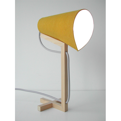
This table lamp is called Cudepoule and it is designed by Claude Saos in 2011. This table lamp has a wooden base and shading made out of bright yellow fine felt fabric. It's measurements are 25x23x11 cm, and would be a medium sized attribute to any home. Sadly, this is just a prototype, but I hope to see it in production in the near future! 
I really like the simplicity of this lamp! The cross in the base that carries the whole structure, and the lamp shade that is resting on the angle from the stem. An other smart detail is the way the cord is included in to the design, so that the electrical cord is not only for practical use but also for visual reasons. If you like the Cudepoule and want to see more of it, or more from the designer, you have to visit www.claudesaos.com.

tirsdag 5. juli 2011

Licor Cafe

This set is called the Licor Cafe and it was designed by Thomás Alonso to specifically hold the hand made liquor made by his father, Enrique Alonso. Licor Cafe is the name of the liquor, and also the set to honor the special beverage his dad has been making for many years. The set consist of one bottle and five glasses to serve five friends around the table. Each friend can pick the glass of its choice, but none of them have to worry: Each glass holds the same quantity of Licor Cafe. The licor is a traditional recipe from Galicia in North West of Spain, Licor Cafe is made from Orujo, coffee beans and sugar. 

I think that the Licor Cafe is a beautiful set, and is perfect for serving or just having out as decoration. The thought behind it is really beautiful, and the fact that the designer wanted to honor is father is precious! I like that the materials he chose is as natural as glass and cork, and the little note on the bottle is a nice little detail that creates a whole in the set. My most favorite thing about the Licor Cafe is that all of the glasses have different shapes, but contains the same amount of fluid.  
If you would like to see more pictures of Licor Cafe or read more about the designer, you have to visit www.tomas-alonso.com.

James

This is table is called James, and it is designed by Ilot Ilov. This small, three-legged table is a true servant that can be set up at any given place. There is no need for a tabletop because one single plate can be turned into an individual tray. You can use a plate, a bowl or a vase. The wooden sticks keep everything in balance while the rubber-topped tips stops the objects from sliding away. James is made out of ash wood, synthetic rubber and steel, and it comes in the colors white and nature (wooden). It is a 100% hand made, and is produced in Germany.
I like both the idea and the execution of this tripod, and this type of furniture is something we don't see a lot of in the interior world. Think how great it would be to have somewhere to place any given object, right where you are standing/sitting/lying. If you like having your breakfast in bed, James will be your best friend. And after use, the effective butler is store without effort, because it folds easily back into a handy format. You can obviously use this for practical things, but just imagine how many things you could put on display with this table! The sky is the limit, and you can try anything you would like. What a great way to explore your options!
If you would like to see more from Ilot Ilov or James, you have to visit www.llotllov.de.

mandag 4. juli 2011

Urban Collection

These chairs are the Urban Collection and they are designed by danish Søren Rørbæk for Oliver Furniture in 2010. This collection is specifically designed for teenagers, and it consists  of a table, a bench and a chair. The table is very simple, and it is designed for the modern teenager's bedroom. It can be used in a very feminine room, as well as in a rougher environment. The bench is perfect for sitting together while being in front of the computer. The chair is tiny and simple, and can easily be put a side. Even two chairs around a table will be discrete and take up minimal space. Oliver Furniture is even thinking about expanding the collection with a bed, other types of benches, racking and shelving. The collection in produced in two different sizes.

I really like this collection, and what I like the most about it is no surprise: The different colors you can choose from on the legs of the bench, chair and table. It's always a big plus when you can choose from a range of colors to best match your room or your home. Its an even bigger plus when the colors are as amazing as the colors the designer has chosen. The white top on all of the furniture is beautiful with a small angle, which makes the design even more special. The neutral and natural wooden color you can choose is perfect for a person that wants very delicate colors, and the strong and bright colors are perfect for someone who likes their home to stand out. Something for everyone!
If you like the Urban Collection and want to see more from the designers or from the collection, you have to visit www.oliverfurniture.dk.

lørdag 2. juli 2011

Boxes

Look at these fun Boxes I found! They are from Fabrica Features and are distributed by Seletti. What I think is the really fun part about these boxes is obviously the prints and graphics that are on the lid of the box. Each box has different pictures and figures on top, that represent what you are storing in that box. For example: A box with a camera on it, is storing photos. A box with kitchen appliances on it, is storing cooking recipes. A box with a suitcase on it, is storing traveling things. Pretty genius, right?
I really love these boxes, and the idea behind it. I like that it is so simple, so easy and yet so beautiful and creative! What better way to remember where you put things, than to have different prints to represent them on top of the box? You'll never have to open a million different boxes to find that one thing you were looking for again. I would like to own these in every kind they've got, and I would have them on display so that everyone could see how cool they are. I guess because I love graphics, these really appeal to me.  
Each box is made out of metal, and has a print on top of it in either a pretty color or in just black. You can get them in so many different styles and prints, that you are bound to find one that you like. I think that we have so much stuff just cluttering up our homes, and we just put them away in a closet or in a drawer.... Or worse, let them lie around for everyone to see. Why not put them in a pretty box, so that you know where your stuff is, it helps you organize better and it makes your home clutter free!
If you like these fun boxes and want to see more variations of them you have to visit www.fabricafeatures.com.

Jump Lamp

This lamp is called Jump Lamp and it is a floor lamp designed by french designer Claude Saos. This is a medium-sized lamp that is supposed to resemble a hybrid animal. The long neck and the flat foot render an animated lighting form. What is great about this lamp is that is uses a liquid-cooled LED light bulb and is constructed with a ceramic shade. This means that this lamp does not create heat - no heat will come from the bulb and no heat will escape from this thick shade. The body is made out of wood, and the eye-catching yellow inside the lamp is painted directly on the ceramic shade.
I really, really like the top part of this lamp, but not so much the bottom. It irritates me that the base of the lamp has this shape and color, and I would totally love this if it weren't for that. I would like it so much more if it was round or square, and had a white, black or wooden color... Something about the bottom part does not appeal to me. But what I do like about this lamp is the yellow bright color inside the shape, the wooden structure and last but not least the grey tone of the outside of the lamp shade. It reminds me of concrete! A fun little detail is the little screw that you can adjust the angle with. 
If you like the Jump Lamp too, or want to read more about the designer or other products, you have to visit www.claudesaos.com.

Pano Candleholders

These porcelain figurines are the Pano Candleholders and they are designed by Gonçalo Campos and Maria Bruno Néo. They are produced using a unusual technique, and the material that is used is actually cloths. The name "Pano" is the Portuguese word for "cloth". By using the cotton fabric as the temporary structure to hold the porcelain form in shape, the designers then burn the fabric away and leave only the delicate porcelain behind. "Not using the typical mould creates the great opportunity to make individual pieces in a very efficient way, but still keeping their uniqueness. It's also very special the dynamic brought by the texture and appearance of the fabric that in turn shapes the porcelain." says the designers. 
I think the Pano Candleholders are very beautiful and not to mention unique! I like the small "knitted" details that are placed around on the base, and also the soft finish of the structure... It kind of looks like the fabric is rapped randomly around the candles, but I'm sure that the designers have chosen the position of the cloth very carefully! The grey-ish white tone on the fabric will match anything in your house, and this is not a decoration that is hard to find a place for. If I were to be the lucky owner of these pretty candleholders, I would use them day and night.
If you liked these candleholders and want to read more about them or the designer, you have to visit www.goncalocampos.com.

fredag 1. juli 2011

Family Tea

This tea set is called the Family Tea and is a tea set that is a family, or a family that can be a tea set. It is designed by Paula Benvegnú who is an Argentinian art director and product designer. The tea set is inspired by the idea of family genetics and lineage and the search for a new way to tell a family's story. She created 30 ceramic mugs with a tea kettle based on her family tree. “A common code we are all born with and that will continue appearing in all our defects and virtues: grandfather’s eyes, father’s birthmark, maternal great-grandmother’s white skin, grandfather’s hooked nose… the links are invisible but they are always there… The investigation is based on the imperfections and particularities we all have that we have inherited from someone.” says Paula. 
I really like the concept and the idea behind this tea set, and also the colors the designer has chosen for the mugs. The different shades of sea-green is just breath taking, and the small wooden detail on the tea kettle is the icing on the cake in my opinion. "The tea set represents the family as a whole, and each piece a family member. All of the pieces share the same color palette, however, upon being passed down from previous generations, the tone and quantity of color that each mug shares with prior iterations changes, along with other defining details, but they are still recognizable as belonging to the same set. No two mugs are the same, just as no two people are the same." says Paula. And for one last little detail, she added the family seal and a little spoons with each person's name and birthdate... A really beautiful way to honor your family and ancestors!
If you would like to learn more about the Family Tea or the designer, you have to visit www.paulabenvegnu.com.

Beam Table Lamp

This wonderful little lamp is called the Beam Table Lamp and it is designed by Christian Vivanco. The idea behind Beam was to make a small lamp that is focused on the materials and feeling at the interaction moment with its user. It is made out of a solid block of pine and a thermoformed mma sheet. Christian explains that the project came about accidentally after talking with various local lumberyards, “There I got the chance to realize how beautiful wood can be against an urban background, planks and beams stacked one above the other, some of them rough and other refined. Then it struck me, how interesting it could be to give proper respect to the material and its basic physical qualities; weight, texture, appearance, etc."

I really love this tiny lamp! I mostly love it because of the strong and bold colors, but also because of the functionality and the mixture between the bright colors and subtle wooden material that is used for the base. The good thing about a small table lamp is that it can have a lot of colors and a lot happening, without it ever getting "too much". It has its size on its side! The designer, Christian, selected materials that seemed to fit together perfectly, and I totally agree that this was a good choice. He also wanted to enhance the lamp’s relationship with the user, and rounded the edges so he could create a hugging effect of the hand when holding the lamp! Colorful, tiny, cute and modern... Could one ask for more in a table lamp?
I had to post this drawing also, off course. If you have followed my blog, you know that I just illustrative pictures, drawings and sketches... Bare with me, haha! If you would like to read more about the Beam or the designer, you have to visit www.christianvivanco.com.

tirsdag 31. mai 2011

Trap Light

This pendant lamp is called Trap Light and it is designed by Eidhoven-based designers Gionata Gatto and Mike Thompson. The project takes a radical new approach to lighting design through the use of photoluminescent pigments to capture escaping light; and conventing waste energy back into visible light. "Photoluminescence is a process in which energy absorbed by a substance is gradually released as light, and using the Murano glass blowing technique, the designers were able to embed photoluminescent pigments into the glass body of the lamp." is how the website describes the function of the lamp. 
What is really special about this lamp, is the unique and innovative function of it. Through the process the Trap Light becomes both shade and light source, emitting, absorbing and re-emitting the light. With just thirty minutes "charge" of recycled light from a traditional incandescent or LED light bulb and the lamp will provide up to eight hours of lighting. This is just amazing, as well as beautiful to look at! The different tones of light in blue and white gives a pretty glow, and the design and structure in it self is also an eye-cather... Even though it's not a huge secret that the function is the biggest attraction to the Trap Light. 
If you want to read more about the Trap Light or the designer, you have to www.traplightsaveenergy.com.

The Green Hanger

This is The Green Hanger, and it is made in Australia from 100% recycled cardboard. The hanger is an eco coat hanger that is fully recyclable and biodegradable, and is made only from recycled materials. If the plusses for eco-points isn't convincing enough, this hanger is very thin and makes it easy to stack and store. Your clothes will not tangle on this, and the hanger can hold 4kg across the shoulder of the hanger. It also comes in kids-sizes as well as adult. If you would like to read more about this Green Hanger or read more facts (before you decide if this can replace your old plastic/wooden ones) you have to visit www.greenhanger.com.au

Virtue of Blue

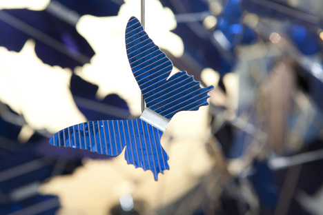
This amazing chandelier is called the Virtue of Blue and is designed by Jeroen Verhoeven for dutch design house Demakersvan. This chandelier is covered with 502 blue butterflies, which are made in the shape of 4 different breeds. These butterflies are not only pretty to look at, they are also the energy source of this whole lamp. The butterflies are actually made out of sapphire-blue solar panel cells, and the piece is self-sustaining as it absorbs the energy of daylight to fuel its own illumination. 
This chandelier is not only pretty to look at, but also very eco-friendly and smart. The fact that the butterflies are made out of solar-panels are very cleaver and two different ways: It saves the environment and it gives the butterflies a glittery look and absorbs more light. I like how the shape of the chandelier is abstract and very organized at the same time. The different shapes of the butterflies makes the butterflies look like they are actually flying around like they would in reality. The Virtue of Blue is a smart design, a beautiful design and a very innovative design with a function we will see more of in the near future. 
If you think this chandelier is beautiful too, or want to see other products from the designer, you have to visit www.demakersvan.com

mandag 30. mai 2011

Serpent

This is the Sperpent shelving and it was designed by Bashko Trybek in 2011. What is special about this shelving system is that is is a modular system in which the user can choose the dimensions of the shelf and adjust them according to his or her needs. The shelf allows to combine and arrange the shelves to fit various interiors and spaces. The structure is plain and makes the product sustainable and easy to recycle.
What I like about this shelving system is obviously its great function and its abilities. The fact that you can change the dimensions and the appearance of the shelf as you like. The colors of the wires and the natural wood on the actual shelfs go great together and make the shelving look visually stunning in addition to the genius function. This shelf is bright, colorful and beautiful and a great piece of furniture for the indecisive person who likes to change their home a lot. 
If you would like to read more about this design or the designers, you have to visit www.bashko-trybek.com.
Related Posts Plugin for WordPress, Blogger...